How to organize a city's services catalog so people can actually find things
When someone needs a proof-of-residence letter for their child, they don’t know (and have no reason to know) that it’s issued by the Municipal General Secretariat. They know they need the paper and, at most, that it has something to do with “city paperwork”.
The distance between how a city government is organized on the inside and how people search from the outside is almost the whole problem of designing a services index. And it’s an information architecture problem before it’s a code problem.
I worked on the procedures and services catalog for the municipality of Tizayuca, in Hidalgo, Mexico: more than a hundred records spread across several agencies and dozens of departments. This is what I learned putting them in order (the project is also in my portfolio).
The starting point was a spreadsheet
I’ll start here because it changes the kind of work involved.
What existed had no categories, no keywords, nothing of the sort. It was a spreadsheet with links to PDFs and very basic information. Published as is, that gives you a page that ticks the “it’s published” box and isn’t good for much else.
And it wasn’t useful for a specific reason: residents don’t know the official name of a procedure. Nobody searches for “certificate of residence for school enrollment purposes”. People search with plain words.
They don’t care about the full name of the department either, which changes every so often anyway, and they don’t want to land on a table with hundreds of files and technical names. What works for them is arriving and seeing categories, a search box and filters.
That was my proposal when I built this section of the portal: instead of publishing the catalog, turn it into something you can navigate. What follows are the decisions that came out of that.
Two ways of ordering that always clash
When you ask for the catalog, you get it ordered by org chart: each department sends its procedures, with its internal code and the name of the office responsible.
That order is real and useful to the city. It tells you who answers for what, who updates the requirements and who to complain to when something is wrong. It’s the map of responsibilities.
But it doesn’t reflect what people need. Someone visiting the site gains nothing from knowing their procedure belongs to the “Department of Integrated Risk Management, Civil Protection and Fire Services”. What helps them is knowing that’s where they get the safety report they were asked for to open their shop.
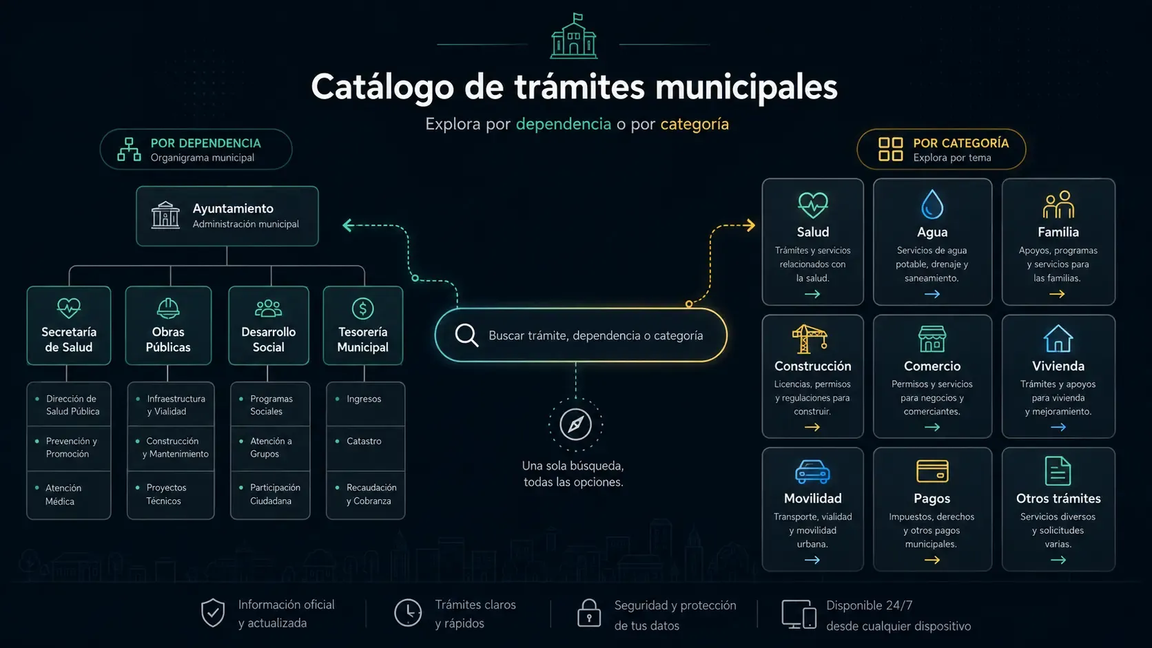
So you end up with two structures over the same procedures:
- The administrative one: agency, department and code. It already exists.
- The thematic one: Health, Water, Family, Employment, Construction, Environment… It has to be built.
The usual mistake is to pick one. What works is keeping both and deciding which one people enter through.
Why the org chart doesn’t work as a front page
As an entry point, the administrative structure has a serious flaw: to use it, you already have to know the answer.
To browse by department you need to know which department handles your issue. If you know that, you didn’t need the index. If you don’t, which is the normal case, the menu by agency leaves you just as lost, only with more tabs.
There’s a second problem: the org chart changes. Every administration reorganizes secretariats, merges departments and renames things. If your main navigation is the org chart, the site breaks with every change of government. Thematic categories hold up better: “Water” will still be called that three administrations from now.
That’s why the administrative structure doesn’t disappear, but it’s kept as data on each record, not as the backbone of the navigation.
Building the categories
This is where you find out whether the index works. A few things turned out to matter:
Categories come from what people need, not from what procedures are called. “Service contract request”, “Disconnected connection”, “No-debt certificate” and “Discharge permit” don’t share a single word, but all four are about Water. If you group by similar names, you don’t group anything.
A procedure can be in more than one category. It’s the decision that generates the most debate, and it’s worth defending: every procedure has to be able to sit in several categories instead of hanging from a single branch. A food assistance program for minors is Food, and also Children, and also Family. If you force it into just one, two out of three people will look for it where it isn’t.
The number of categories is an uncomfortable balance. Today there are twenty. With fewer, each one returns so many results that it’s a long list again; with many more, choosing between them is harder than searching. There’s no right number: you have to look at how many procedures fall into each and split or merge the ones that end up lopsided.
And you need an “All”. It sounds trivial, but it’s the emergency exit: when someone doesn’t recognize themselves in any category, the only alternative to leaving is seeing the full list. Removing it to make the screen look cleaner is one of the most damaging things you can do.
A procedure and a service aren’t the same thing
It’s a distinction that looks administrative and turned out to be useful for residents:
- A procedure is something you request that ends in a document or an authorization: a license, a certificate, a report.
- A service is something the city provides to you: sports classes, a community kitchen, legal advice, medical care.
For the person searching, the difference is in what they have to bring and what they’ll get. You go to a procedure with papers and leave with a paper; you go to a service and they attend to you. They’re two different expectations, and mixing them in a single list confuses both.
That’s why I separated them in a top-level filter, above the categories.
Icons are part of search too
It’s the decision I underestimated most at first and ended up most convinced of.
A list of twenty categories in plain text has to be read word by word, top to bottom, until you find the one that fits. The same list with an icon per category can be scanned: your eye goes straight to the right area without reading.
For someone who browses comfortably the difference is small, but for someone who doesn’t, it’s huge. A municipal portal gets older people, people in a hurry and people who don’t use the web every day. Being able to find what they need just by looking at the screen is often what decides between completing the procedure online or calling on the phone.
Two things I learned adding them:
- The icon has to represent the category, not the procedure. A drop for Water, a house for Housing. As soon as you try to draw “No-debt certificate”, you get something that means nothing.
- The icon goes with the text, it never replaces it. An icon without a label is a riddle, and it also leaves out anyone using a screen reader.
Why search matters more than the menu
If I had to keep just one idea, it would be this.
Categories are for exploring, when you’re not quite sure what you need and want to see what’s there. But many people arrive with a specific word in mind (“property tax”, “birth certificate”, “license”, “scholarship”), and for that person any menu gets in the way.
Building decent search for a catalog this size isn’t technically hard. The hard part is deciding what it searches:
- The procedure name, of course.
- The department name, for people who do know where they’re going.
- The code (
SGM-CRME-006and similar), because if someone gave it to you at the counter it’s the most precise term there is. - And, if you can, everyday synonyms. People type “birth certificate”, not “issuance of a certified copy of a birth record”. That dictionary of equivalents is manual work, and probably the improvement that pays off most for the effort it takes.
A detail that isn’t minor: search has to ignore accents and capitalization. The catalog comes in capitals with accents applied inconsistently; people search in lowercase and only sometimes add accents. Normalizing both sides before comparing avoids a lot of “no results” that shouldn’t happen.
You don’t write the catalog
This part doesn’t show up in information architecture tutorials, and it shapes the whole project.
The data is written by the departments. Each office sends its procedures with their names, requirements and codes, and you don’t control the spelling, how things are named or the level of detail. You get very long names, different abbreviations for the same thing and whole texts in capital letters.
Two design decisions follow from that:
- The interface has to cope with ugly data. A twelve-word title in capitals can’t break the card, so you design for the real worst case, not for the nice example in the mockup.
- The code is the only reliable identifier. Names change between versions of the catalog and the code doesn’t. It’s what lets you update without duplicating and link to a record knowing the link will keep pointing to the same thing.
And a recommendation for anyone starting something like this: keep the thematic category on your side, not in the data they send you. It’s what you contribute and what you’ll adjust most; if you mix it with what comes from the departments, every catalog update will wipe it out.
What’s hard to explain internally
The technical part wasn’t the hardest. Often, inside the city government, icons, categories and keywords aren’t given any importance, because people don’t see what they add or how much easier they make things for residents.
For some areas, publishing the catalog means uploading the list of links with their codes, and everything else is seen as decoration or extra work. It’s hard to explain that, for someone looking for a procedure, a good user experience is more useful than a catalog of links, even if both contain the same information.
That’s why much of the work on a project like this is explaining and defending those decisions, not just implementing them.
What I’d do differently
- I’d start with the twenty most searched procedures, not the full catalog. Categories come out much better when they’re built from what people actually ask for, with everything else fitted in afterwards.
- I’d log searches from day one. Searches with no results are the best to-do list you’ll ever have: each one is someone who didn’t find something that probably does exist, and it tells you exactly which word they used.
- I’d treat the synonym dictionary as part of the product rather than an extra, because that’s where almost all the distance between the city’s language and people’s language gets covered.