Why you should build mobile first
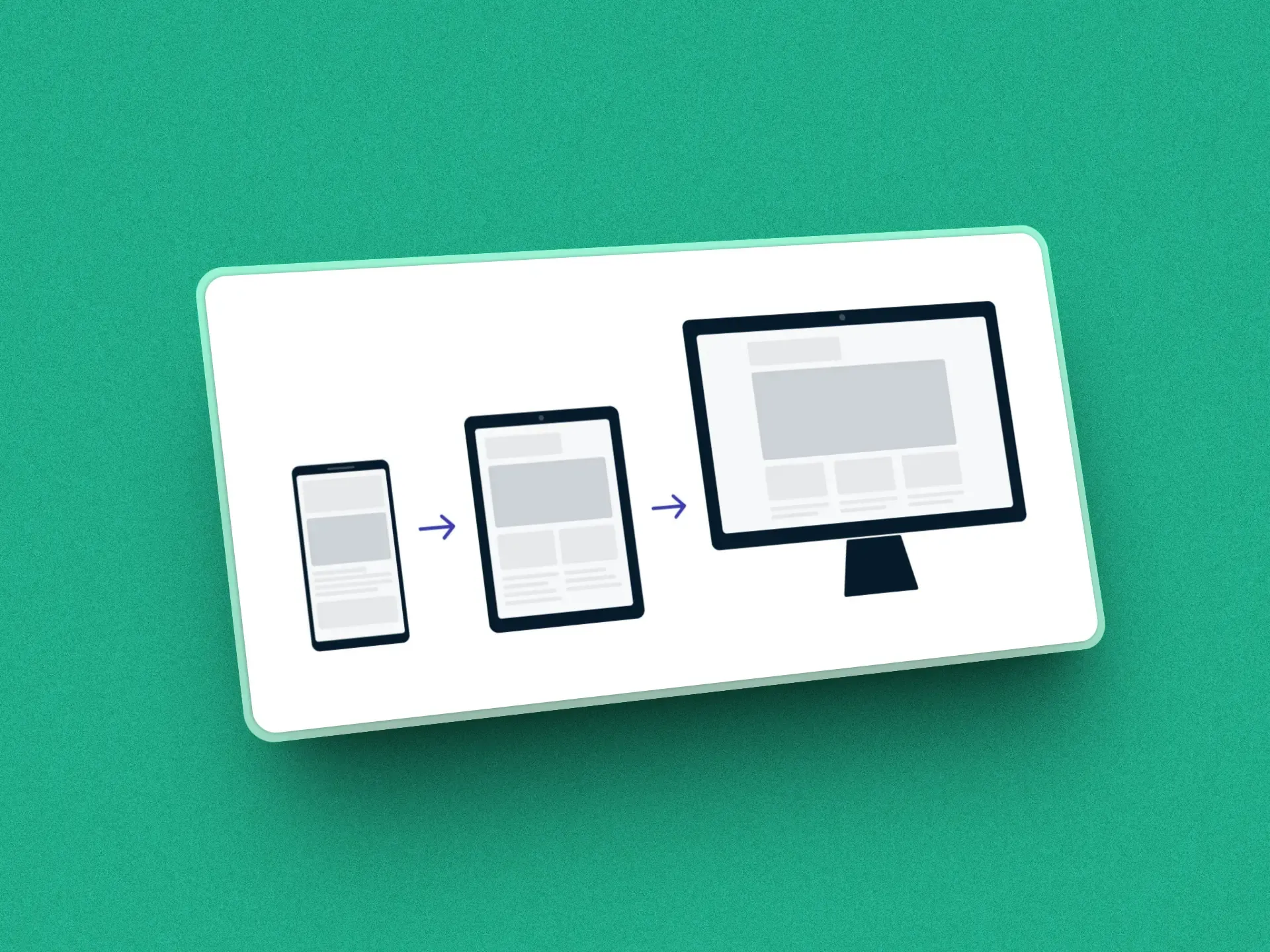
Designing mobile first means starting with the smallest screen and then expanding the design for tablets and desktop. It’s the opposite of what we did for years: design for desktop and then keep trimming until it fit on a phone.
It sounds like a matter of order, but it changes the result quite a bit.
Why start with the phone
More than half of web traffic now comes from phones, and Google indexes sites using their mobile version. If the mobile version is the one that got built last, it’s also the one the search engine sees.
But there’s a weightier reason: starting with the small space forces you to decide what matters. On a desktop screen everything fits, so it’s easy not to prioritize anything. On a phone it doesn’t fit, and you have to choose what comes first, what can be tucked away and what isn’t needed. When you then scale up, you’re adding to a base that’s already clear.
The other way round is harder. Adapting a desktop design to mobile usually turns into a list of exceptions: hide this, stack that, shrink the other. And every exception is a place where something can break.
How it looks in CSS
In practice it means writing the base styles for mobile and using min-width media queries to add what changes on larger screens:
/* Base styles: mobile */
body {
  font-size: 16px;
  line-height: 1.5;
}

/* From 768px up (tablets) */
@media (min-width: 768px) {
  body {
    font-size: 18px;
  }
}

/* From 1024px up (desktop) */
@media (min-width: 1024px) {
  body {
    font-size: 20px;
  }
}
If you find yourself writing lots of max-width, you’re probably working desktop first even if you don’t mean to.
How it looks in Tailwind
Tailwind already works this way by default. A class with no prefix applies to every screen, and the sm:, md:, lg:… prefixes add styles from that width up:
<div class="flex flex-col gap-4 md:flex-row md:gap-8">
  <!-- One column on mobile; a row from md up -->
</div>
That’s why it helps to read md: as “from md up” rather than “on tablets”. Tailwind also has max-* variants for the opposite case, but if you use them everywhere you’re back to designing from the desktop.
What weighs most on a phone
Beyond layout, three things matter much more on mobile than on desktop.
Images. They’re usually the heaviest part of a page. Use lightweight formats like WebP (or SVG for icons and illustrations) and lazy loading for the ones that aren’t visible on arrival:
<img src="image.webp" loading="lazy" alt="Image description">JavaScript. Every library you add gets downloaded and run on a processor that’s a lot slower than your computer’s. Before adding a dependency, it’s worth asking whether you need it, and loading scripts with defer so they don’t block rendering:
<script src="main.js" defer></script>The size of what gets tapped. A button that’s easy to click with a mouse can be hard to hit with a finger. Give it a comfortable size and leave space between elements so people don’t tap the wrong one:
button {
  padding: 12px 20px;
  font-size: 16px;
}
WCAG 2.2 sets a minimum of 24×24 pixels for any interactive element; I explain it in the WCAG 2.2 checklist.
Testing it properly
The browser’s DevTools have a device mode that’s handy for checking as you work, and Lighthouse gives you a quick idea of mobile performance. But neither replaces opening the site on a real phone, with its own connection and screen, and using it with one hand.